5. Canvas types
5.1 Choosing one
A new canvas tab opens on the chooser:
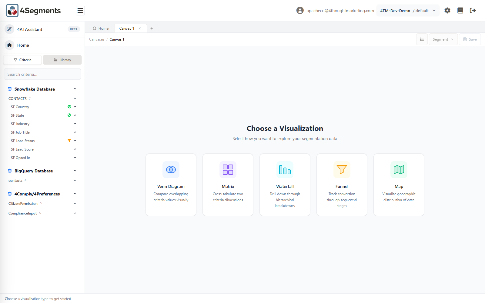
Choose a Visualization Select how you want to explore your segmentation data
| Card | Description | Use it when |
|---|---|---|
| Venn Diagram | Compare overlapping criteria values visually | You want to see how two or three conditions overlap |
| Matrix | Cross-tabulate two criteria dimensions | You want every combination of two fields at once |
| Waterfall | Drill down through hierarchical breakdowns | You want to keep narrowing, one field at a time |
| Funnel | Track conversion through sequential stages | Your data has an ordered lifecycle field |
| Map | Visualize geographic distribution of data | Your data has a country or state field |
You can skip the chooser: drop a criteria value on a blank tab and it becomes a Venn; drop a criterion that an administrator has configured as a funnel or a map, and the canvas becomes that type.
Every canvas type supports the same downstream actions — select, count, list records, save, export, schedule, export the picture. The differences are in how you get to the selection.
5.2 Venn diagram
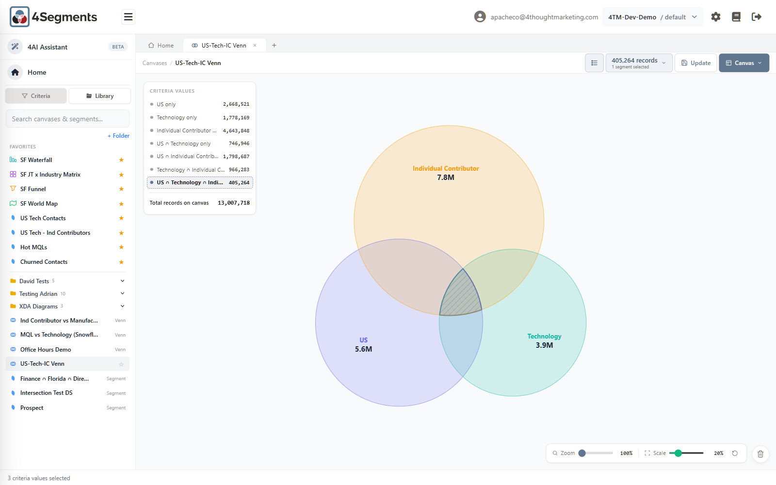
The default and the most-used type. Up to three circles, each one a criteria value or a saved segment. Circle area is proportional to record count, and the overlap areas are solved so they are proportional too.
Building one
Drag or double-click criteria values from the sidebar. A fourth attempt gives:
A Venn diagram can show at most 3 circles. Remove one before adding another.
Saved segments can be circles too, and count against the same limit.
On-canvas controls
The legend panel (top-left) is the main readout. It lists every region with its exclusive count, ends with Total records on canvas, and every row is clickable.
The trash can (bottom-right) removes a circle — drag its name label there.
Zoom and Scale (bottom-right) are two sliders, unique to the Venn:
- Zoom (100–200%) magnifies the diagram so you can click a small overlap. You can also wheel-zoom, and drag empty space to pan.
- Scale (0–100%, default 20%) grows the smaller circles toward the size of the largest. At 100% all circles are the same size. This makes a tiny circle clickable — but remember that once you move it, the areas no longer represent record counts. This is great for selecting; it is misleading if you forget you did it.
- The Reset view button restores 100% / 20% and clears any panning.
Colours
Circles are coloured from a fixed eight-colour rotation by position. Colours are not configurable and carry no meaning.
Two gotchas
- Dragging a circle's edge pans the canvas. To move or merge a circle you must grab its name label.
- The legend panel is drawn outside the chart, so it is not included in an exported PNG/JPG/PDF of a Venn. Screenshot the window if you need the numbers alongside the picture.
5.3 Matrix
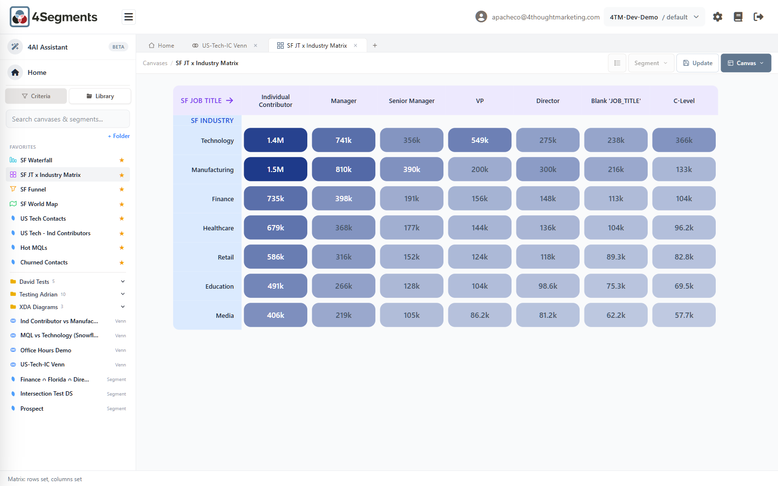
A cross-tab. One criterion down the rows, another across the columns, every intersection counted and shaded.
Building one
Drag a criterion (the header row in the sidebar, not one of its values) onto the canvas. The first sets the rows; the second sets the columns. Criteria values are ignored on a matrix, and saved segments are refused:
You can't add a saved segment to a matrix canvas.
The 7×7 limit
A matrix shows the top seven values of each criterion, ranked by record count. Anything beyond that is not displayed, and there is no "Other" bucket — those records simply are not on the canvas. The limit is 49 cells because each one is its own database query.
If the field you care about has thirty values, a matrix will show you the seven biggest and quietly omit the rest. Use a Waterfall or a Venn for the long tail.
While it loads
Cells stream in individually, with a progress chip above the grid reading Calculating cells… 18 / 49. Cells that have not arrived show a shimmer and ignore clicks. The heat shading recalibrates as larger cells arrive, so colours shift while loading. Once complete, the result is cached and revisiting the tab is instant.
Selecting
Click a cell to toggle it. Click a column header or a row label to toggle that entire row or column at once — the fastest way to select "everything in Manufacturing".
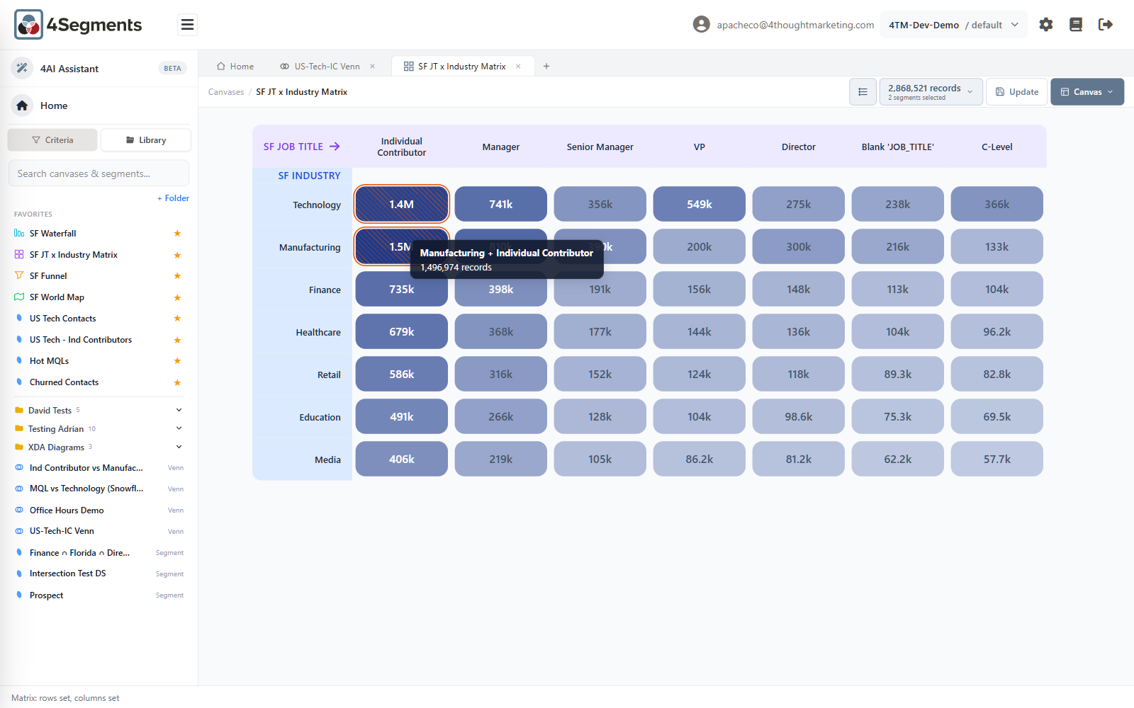
A cell is row AND column. Several selected cells are OR'd together as pairs, so an
L-shaped selection stays an L-shape and is not widened into a rectangle.
Counts on a matrix can be provisional. See 4.8.
5.4 Waterfall
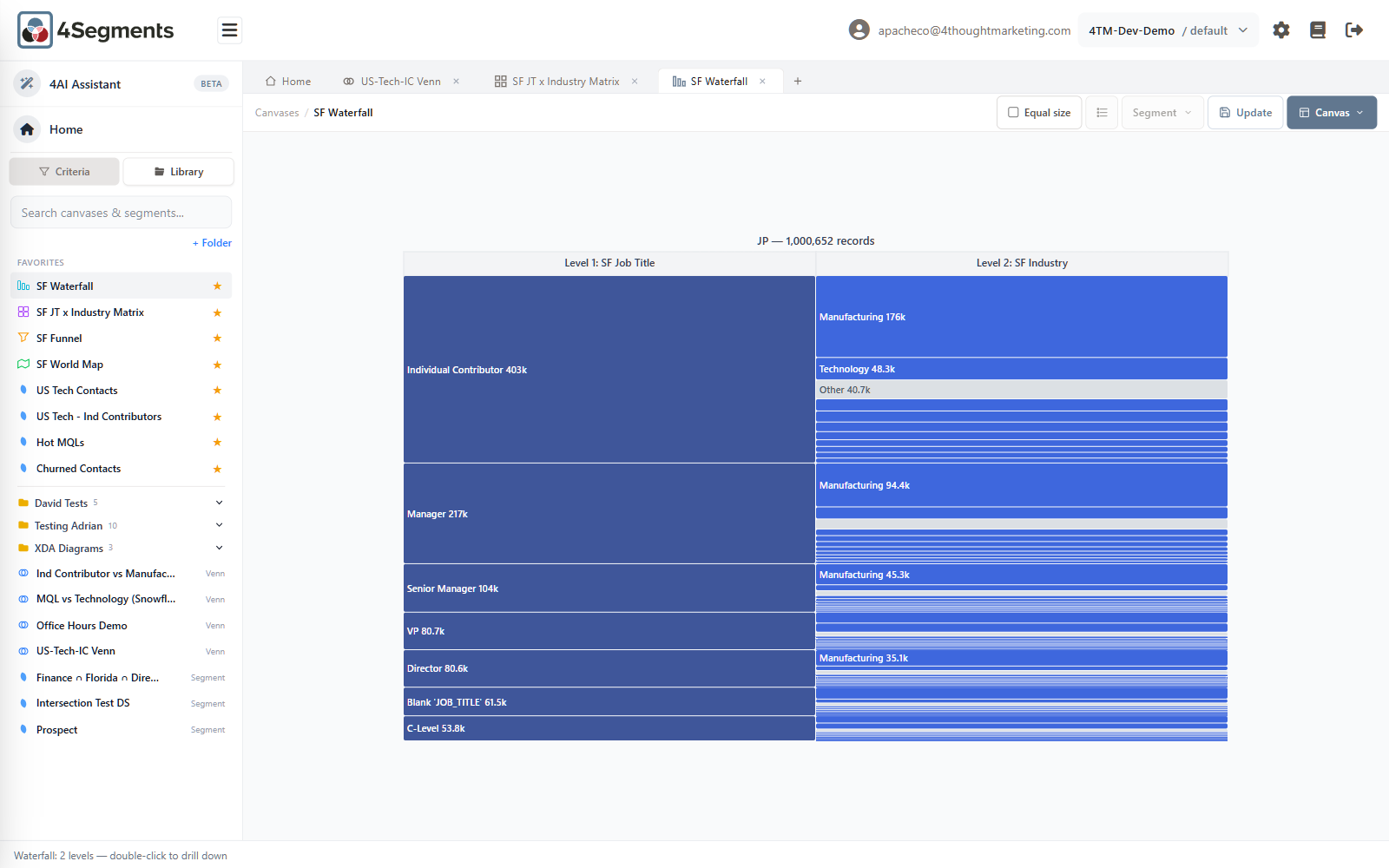
Successive breakdowns, left to right. Start with one set of records, split it by a field, split each of those by another field.
Building one
- Drop a criteria value or a saved segment — this is the root.
- Drop a criterion — this becomes level 1.
- Drop another criterion for level 2, and a third for level 3.
The status bar guides you: Drag a criteria value or saved segment to start the waterfall, then Now drag a criteria column to break it down.
Maximum three levels.
A waterfall can drill down at most 3 levels.
Before the third level, 4Segments warns you:
Performance Warning Adding a 3rd waterfall level generates a large number of queries (N × M × K combinations). This may take 2–5 minutes to complete depending on the dataset size. Cancel · Yes, Add Level
Take that warning seriously on large datasets.
The "Other" bucket
Each level shows the top ten values of that criterion. Everything else is collected into a grey band labelled Other.
Other is a real, selectable segment — it means this parent, and none of the named siblings. Selecting it and exporting gives you exactly the records shown, not the whole parent.
Drilling in
Double-click any bar that has children to zoom into it. The chart re-scales, the level headers update, and a ← Back button appears at the top-left.
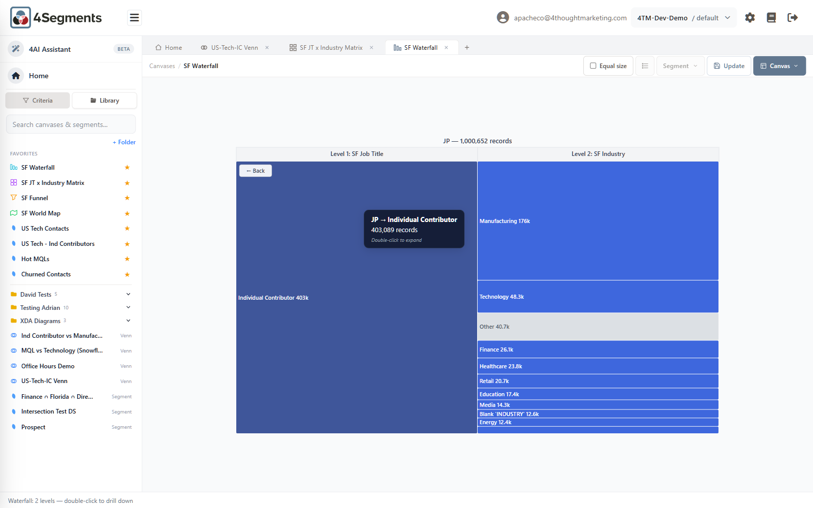
Double-clicking a leaf does nothing. The tooltip on any bar shows the full path
(JP → Individual Contributor), the count, and — where applicable — the hint
Double-click to expand.
Equal size
A checkbox in the toolbar, Equal size, with the tooltip Render every segment the same width (real counts still shown in tooltips).
Turn it on when a giant first bar squashes everything else into invisibility. It is a display change only — no new queries run, and the real numbers stay in the tooltips.
5.5 Funnel
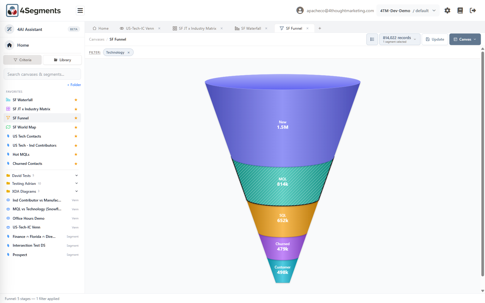
Stages of a lifecycle, drawn as a cone. Band height is proportional to record count.
It has to be configured first
A funnel is not automatic. An administrator must nominate which values of a criterion are stages, and in what order (Chapter 12). Criteria that are ready show an amber funnel marker in the sidebar.
Drop an unconfigured criterion and you get a helpful dead end rather than an error:
SF Lead Score isn't configured as a funnel yet. Open Admin to pick which values are in the funnel and their order, then drop the criteria here again. Open Admin
Selecting
Click a stage to select it; click more to add. All stages belong to one criterion, so a multi-stage selection is an OR — "MQL or SQL".
There is no cap on the number of stages, and no tooltips (the counts are drawn on the bands themselves).
Filters
The Filter: strip above the canvas is shared by Funnels and Maps. Drop criteria values onto it to scope every stage at once — in the screenshot above, every stage count is within Technology.
The strip shows how filters combine, with visible OR pills inside one criterion and AND pills between criteria. Its tooltip spells out the trap:
Filters combine with AND across different criteria and with OR within the same criteria. Adding values from many different criteria can return zero records if no row matches all of them.
You can also drop a saved segment onto the strip. That is powerful — "show me my funnel, but only for Hot MQLs" — with two restrictions:
Only one segment filter can be applied at a time. You can't combine a segment filter with value filters on the same canvas.
5.6 Map
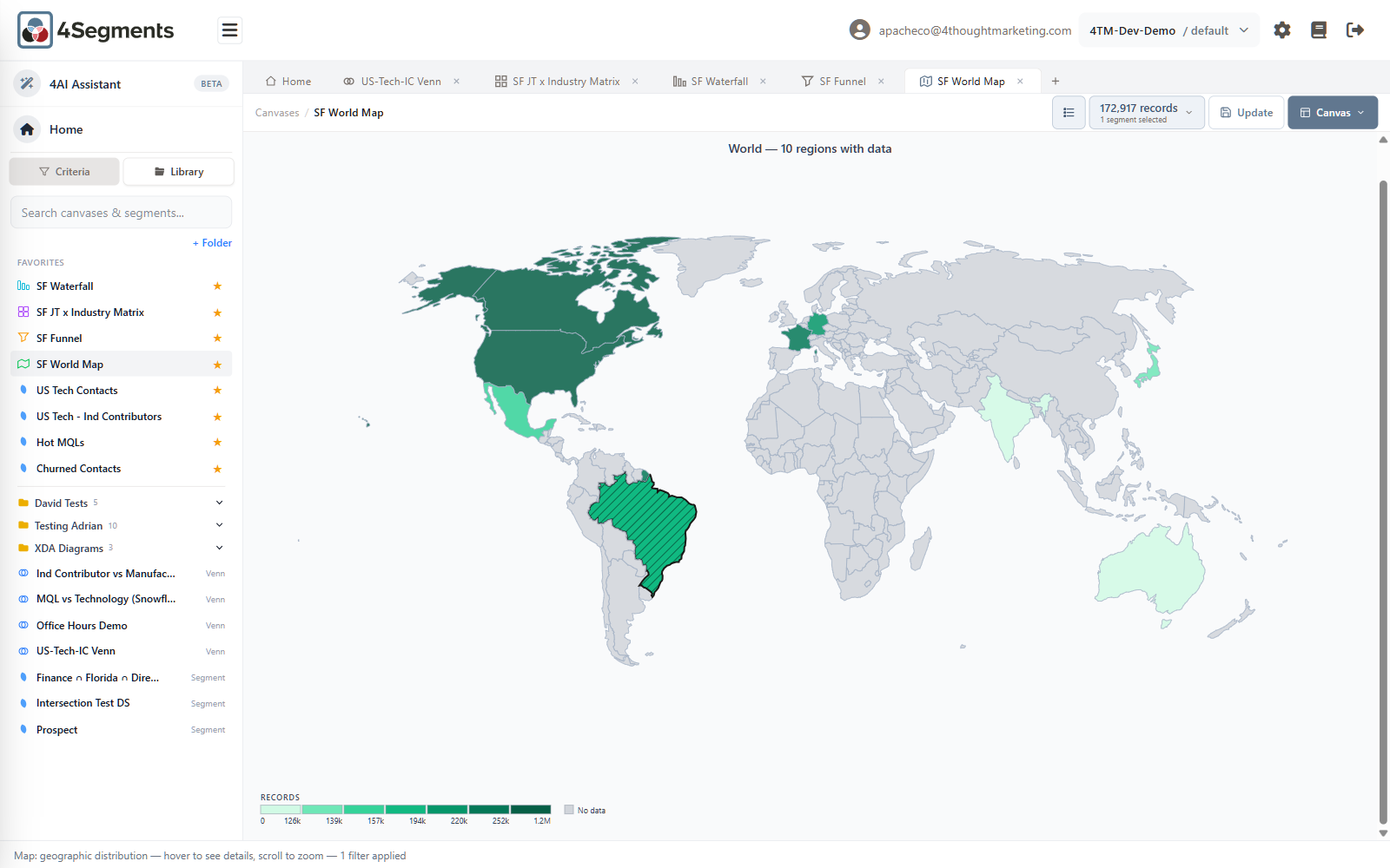
Geographic distribution. Regions are shaded by record count; unmatched geography stays grey.
It has to be configured first
Like the funnel, a map criterion must be nominated by an administrator, who picks which map its values render on (Chapter 12). Criteria that are ready show a green globe marker in the sidebar. Otherwise:
BQ Country isn't configured as a map yet. Open Admin to pick which map this criteria should render on, then drop it here again. Open Admin
Which maps are available
Two, in this release:
- World (countries)
- United States (states)
Values are matched to regions by ISO country code or country name, and by state abbreviation or state name. Around 180 countries and all 50 US states plus DC and the territories are recognized.
If you need a map of a single country other than the US, that is not available today — see Appendix A.
Reading it
The title reads World — 10 regions with data. The legend at the bottom-left, headed
RECORDS, shows the shading buckets with their upper bounds, plus a No data
swatch when some geography has no matching records.
Hovering shows Brazil — 172,917 records, or No data for unmatched regions.
Unlike the Venn, the map's legend and title are drawn inside the chart, so they are included when you export the picture.
Selecting and zooming
Click regions to toggle them; regions with no data cannot be selected. Selected regions get a black hatch.
Wheel to zoom (0.7× to 4×), drag to pan. The Venn's Zoom/Scale sliders do not apply to maps.
Maps use the same Filter: strip as funnels, including saved-segment filters. When a filter is active every region count is recomputed against it.