Reporting
Three screens answer three different questions about your preference centre.
| Screen | The question it answers |
|---|---|
| 4Preferences Dashboard | is anybody using it? |
| Preference Flow Report | which page collected which preference, from which contacts? |
| Preference Analytics | how are opt-in rates moving over a date range, and can I have it in a spreadsheet? |
For one named contact rather than an aggregate, use Contact preferences instead.
Only the first of the three is in the left menu. The other two are at
/preference-flow-report and /preference-analytics.
The demo tenant these figures come from has six preference pages and a handful of contacts, all of whom submitted on the same day several months ago. Every date-ranged panel below is therefore empty, and the figures show the empty states rather than a populated report. That is a gap in the demo data, not a fault in the product.
4Preferences Dashboard
The landing screen for the product. Business Unit in the top right scopes everything on it and reads All until you pick one.
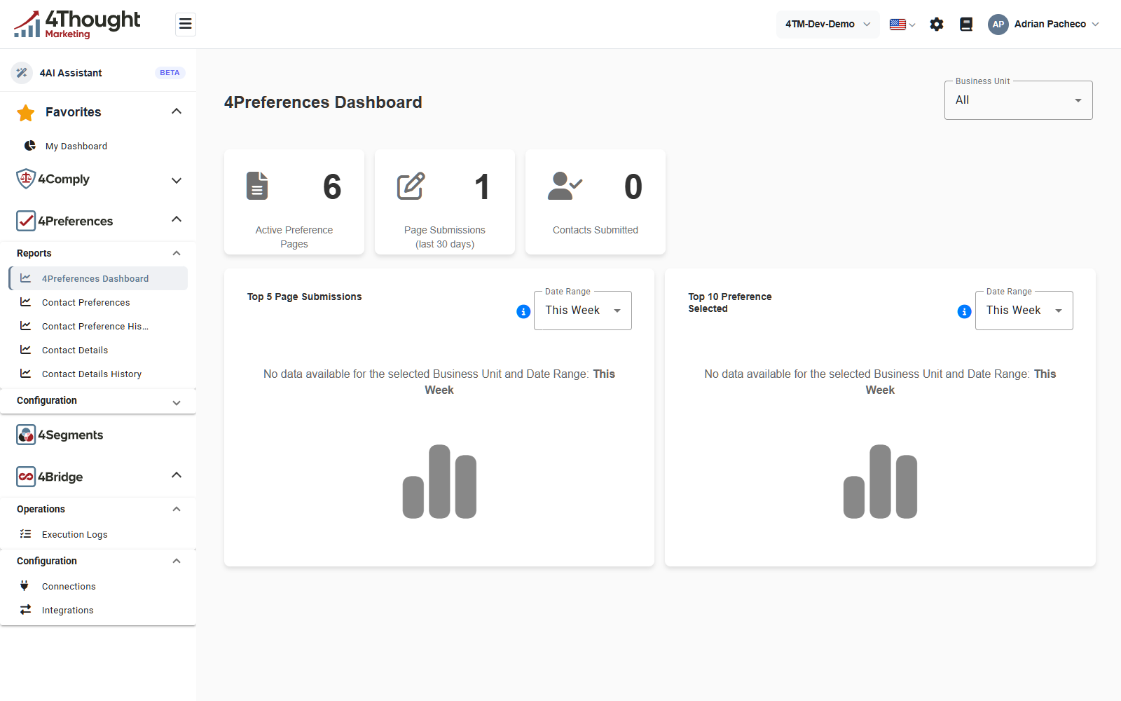
Three count tiles across the top:
| Tile | What it counts |
|---|---|
| Active Preference Pages | pages in the tenant, 6 in the figure |
| Page Submissions (last 30 days) | submissions in the last 30 days, 1 in the figure |
| Contacts Submitted | contacts who submitted, 0 in the figure |
TODO(review): the tenant holds contacts with preferences on file, and the flow report finds them, yet Contacts Submitted reads 0 while Page Submissions (last 30 days) reads 1. Confirm the window and the definition of each of the three tiles, because the two numbers cannot both be counting the same activity.
Below them, two charts, each with its own Date Range picker and an information icon.
- Top 5 Page Submissions, which pages were submitted most.
- Top 10 Preference Selected, which preferences were chosen most.
The Date Range picker offers This Week, Last Week, Last Month, Last 3 Months and Last 6 Months. There is no all-time option, so a chart cannot show activity older than six months. Both charts in the figure read No data available for the selected Business Unit and Date Range: This Week, which is the empty state you get when nothing was submitted in the window.
Preference Flow Report
The most useful of the three for a question about real contacts, and the only way to get from a page to a list of the people who used it. Its own subtitle reads Visual flow of preference pages, preferences, and contacts.
It is a series of columns you click through from left to right. An All Business Units picker at the top scopes the whole thing.
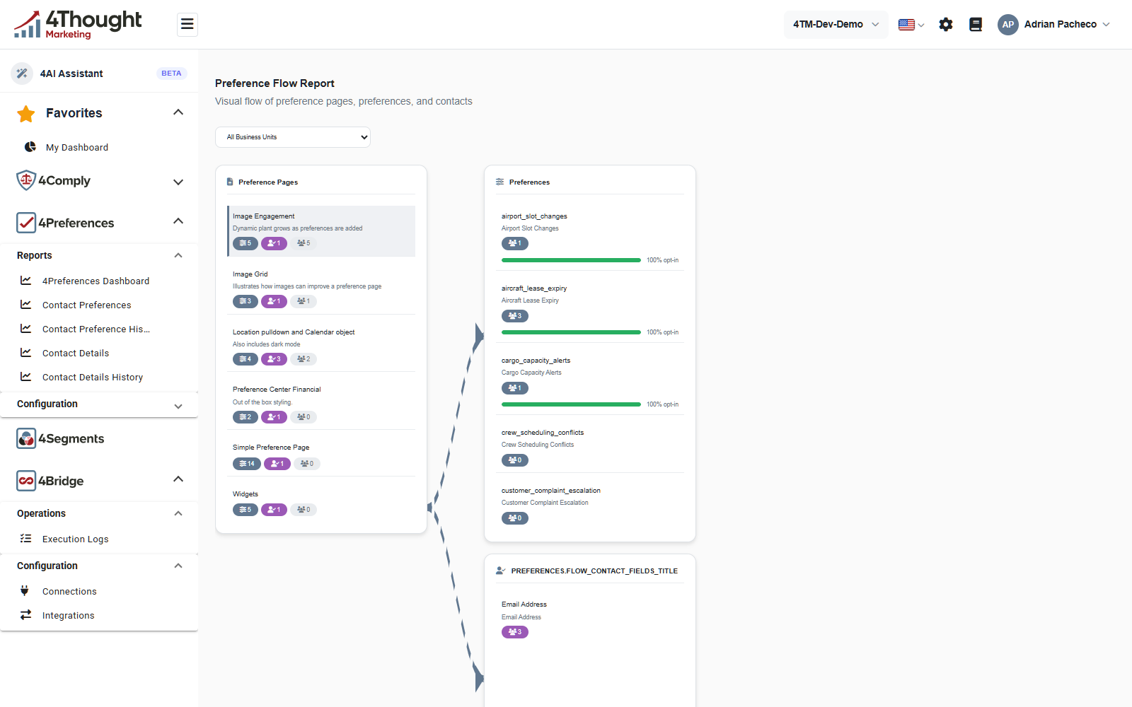
- Preference Pages lists every page. Each entry carries three counts: how many core preferences the page offers, how many core contact fields it collects, and how many contacts have submitted it. In the figure Image Engagement offers 5 preferences, collects 1 contact field, and has 5 contacts.
- Clicking a page opens Preferences beside it, one entry per core preference on that page, each with a contact count and a green bar reading the opt-in percentage. Three of the five in the figure read 100% opt-in; two have no contacts, so no bar.
- A second column below that lists the page's core contact fields with their own counts. In the figure it holds Email Address with 3 contacts.
- Clicking a preference or a contact field opens Contacts: a breakdown of the values chosen and the list of contacts who chose them, with their email addresses. That list is where you get an address to paste into Contact Preferences.
Each preference also has an export, GET /v1/preferenceflowreport/preferences/{id}/export,
which downloads its contacts as an Excel file.
TODO(review): the heading on the contact-fields column renders as the raw string
PREFERENCES.FLOW_CONTACT_FIELDS_TITLE, visible in the figure above. The translation key is
missing from the dashboard's English strings file, so this is a product bug and not a
tenant-specific problem. This page should be re-shot once it is fixed.
Preference Analytics
The date-ranged view, and the one with an export.
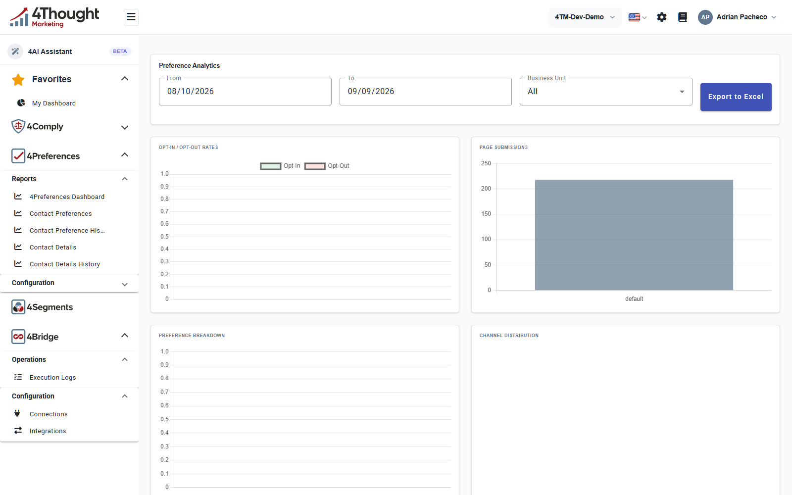
Across the top: From, To, Business Unit and Export to Excel. Unlike the dashboard, the dates are yours to choose rather than a fixed list of windows, which makes this the screen to use for a specific month or quarter.
Four panels:
| Panel | What it plots |
|---|---|
| OPT-IN / OPT-OUT RATES | opt-ins against opt-outs over the range, with a legend |
| PAGE SUBMISSIONS | submissions per page |
| PREFERENCE BREAKDOWN | how often each preference was chosen |
| CHANNEL DISTRIBUTION | how the choices split across channels |
Export to Excel downloads the same data as an .xlsx file, using the dates and business
unit currently selected.
TODO(review): with the default range in the figure, the three empty panels are consistent
with the demo tenant having no recent activity, but PAGE SUBMISSIONS shows a single bar
labelled default. Confirm what default is. It looks like submissions with no resolvable
page name, which would be the same underlying problem as the Unknown Page values on
Contact Preference History.
Widgets on My Dashboard
4Preferences also contributes widgets to My Dashboard, the personal dashboard described in Getting started with the dashboard. They are added from the same Manage Dashboard Widgets dialog as the 4Comply ones.
TODO(review): the 4Preferences dashboard API exposes several series that no 4Preferences screen shows, including contacts by source, expiring permissions, permissions by regulation and a contact ingestion summary. Confirm which of those are the My Dashboard widgets and what each is called in the widget picker, so this section can list them.